Fixed Width Desktop and Full Width Mobile in Divi
Today we show you how to have a fixed width, Divi Page, in Desktop, but a full width when you are in tablet and mobile modes.
The Problem
When you set the Divi Theme to have a fixed width on the desktop, you will get padding in mobile. This is a waste UI real state.
The Solution
If you make mobile full width you get better use of screen space. You also get good UX for mobile devices. In this video screencast, we have step by step instructions AND we make sure you can paste in the required code.
We recommend using a child theme to get started with this effect, as it is the best way to make tweaks to your code.
Let’s get started.
The How To Video
Step 1: Open your WordPress website and go to the admin area.
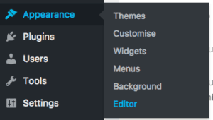
Step 2: Open your child theme editing page:
In the sidebar, this is under themes > editor
Step 3: You should have a style.css file that can be edited.
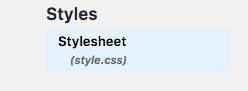
Step 4: Open that file for editing. To do this you just click on the file.
Step 5: Paste in the code provided here:
Step 6: Save the file.
You are all done and ready to go.
Not using a child theme?
You can paste the code snippet in the Divi > Theme Options area. Use the custom CSS area as shown in the video.