Setting Global Styles for Gravity Forms
Stying your gravity forms is now easy with our Gravity form styler for Divi Theme.
The Gravity Form styler creates a global style for all of your Gravity Forms site wide.
It is specifically designed for Divi.
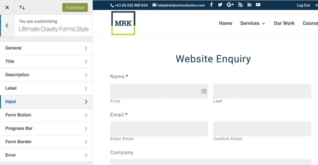
The Theme Customiser
Our Gravity Form Plugin provides options to style title, description, label, input, error, button, border, and other general items using the Theme Customiser.
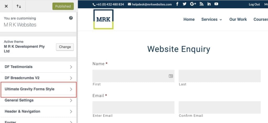
It has the following sections:
- General
- Title
- Description
- Label
- Input
- Form Button
- Progress Bar
- Form Border
- Error
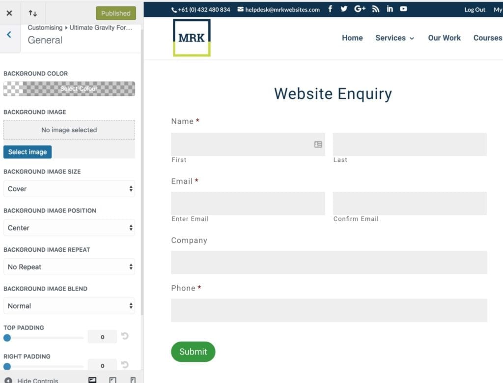
General Section
The general section is used to set defaults for background color/image and set up padding for the form.
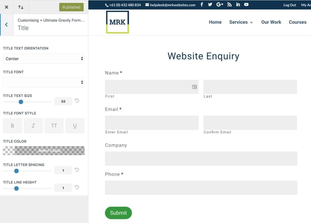
Title
The title section is used to set up the typography settings for the Gravity Forms title
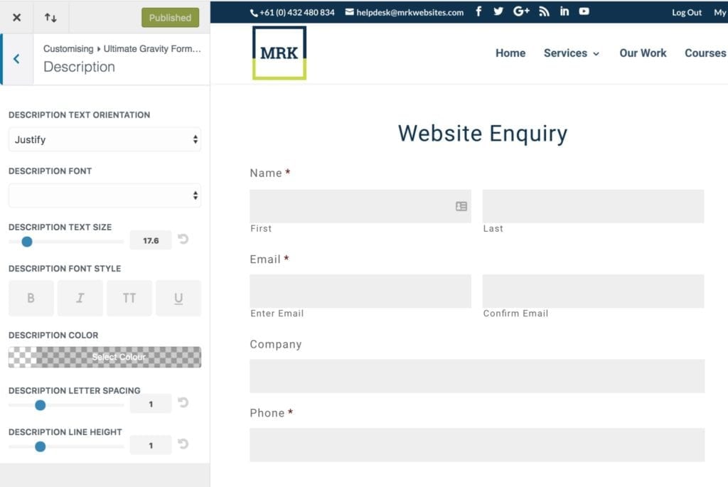
Description
The description section is used to set up the typography settings for the Gravity Forms description text.
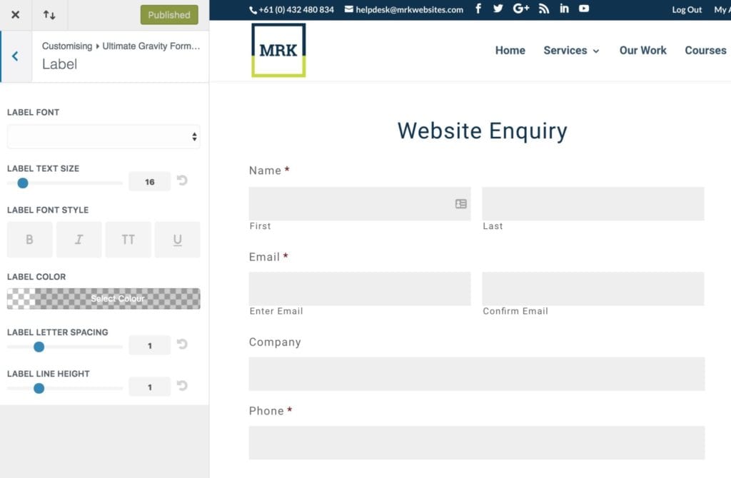
Label
The label section is used to set up the typography settings for the Gravity Forms label text. These are your Form Labels.
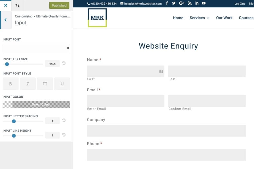
Input
The input section is used to set up the typography settings for the Gravity Forms input fields.
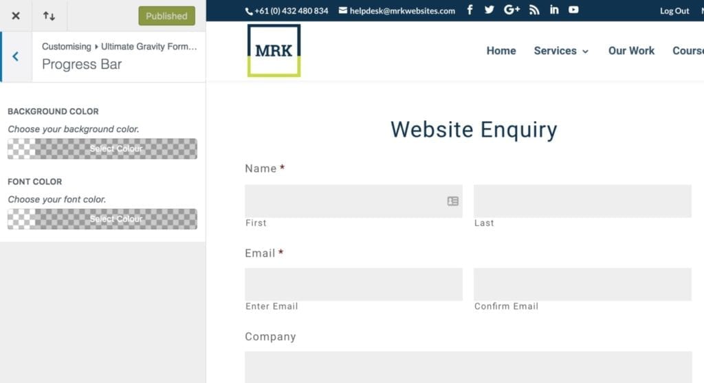
Progress Bar
The progress bar section is used to set up the background and font color settings for the Gravity Forms progress bar element.
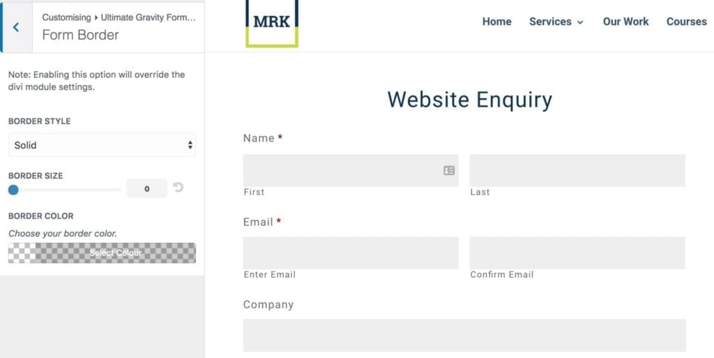
Form Border
The form border section is used to set up the border settings for the Gravity Forms.
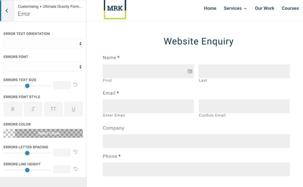
Error
The error section is used to set up the typography settings for the Gravity Forms error element.
Please note that although you can set these styles Divi is forever releasing code that is getting in the way of these styles. From time to time things just break. We always release updates within a week of being notified of an issue.