Global Button Settings
Lesson 4 of 7
2m read.
Beginner
The button styles add styles to the Gravity Form button. Go to Divi > Ultimate Gravity Forms Style for Divi. Select the ‘Button Settings’ on the page (it is selected as default).
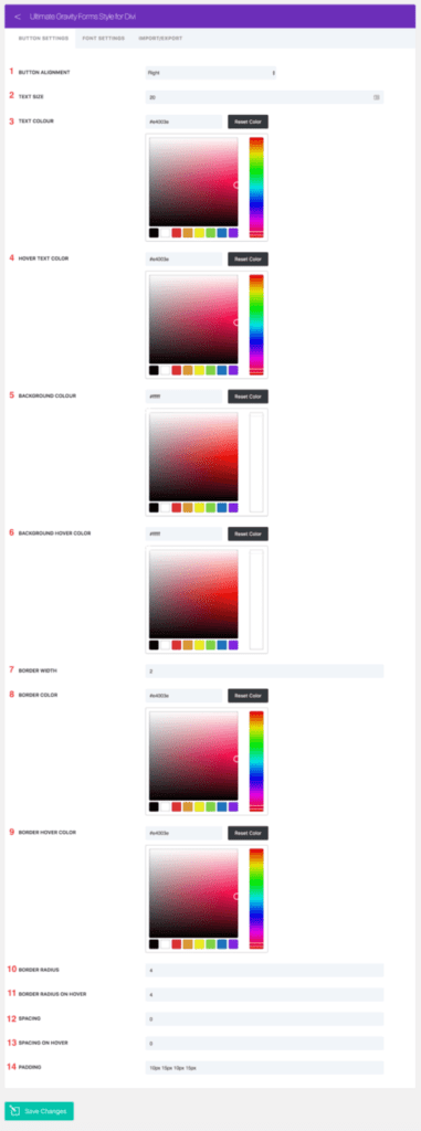
Each setting option in the image above is labelled; Each description is given below:
- Button alignment – aligns the button horizontally to either left, right, or centre.
- Text size – size of the text contained in the button
- Text colour – colour of the text contained in the button
- Hover text colour – colour of text contained in the button when it’s hovered over.
- Background colour – The background colour of the button
- Background hover colour – Background colour of the button when it’s hovered over.
- Border width – Width of the border enclosing the button
- Border colour – Colour of the border enclosing the button
- Border hover colour – Colour of the border enclosing the button when it’s hovered over.
- Border radius – Radius of the border enclosing the button
- Border radius on hover – Radius of the border enclosing the button when it’s hovered over.
- Spacing – Letter spacing of the text contained in the button
- Spacing on hover – Letter spacing of the text contained in the button when it’s hovered over.
- Padding – Button padding.